uMart
Four neighbourhood stores across Singapore with a loyal walk-in crowd — and a website that told none of that story. We rebuilt it end to end, around the questions shoppers actually ask.
Loved offline, invisible online.
uMart's stores work because they're quick: in, out, sorted. Its old website was the opposite — a dated storefront template with a cluttered menu, no mention of the four outlets, and nothing that answered the questions people actually arrive with: where's the nearest store, is it still open, and can I get delivery?
The brief was to make the website as convenient as the shops — and give a four-outlet neighbourhood chain the online presence it had earned offline.
First, the honest audit.
 1
2
3
4
1
2
3
4
An identity from another era
A dated logo and no brand system — nothing that says "your neighbourhood's better convenience store."
Four stores, zero mentions
No locations, no opening hours, no directions — the site's single most-asked question went unanswered.
Seven menu items, no priorities
Internal projects and account links crowd the nav while shopping plays hide-and-seek.
A hero selling nothing local
A generic bundle banner that could belong to any store, anywhere — no neighbourhood, no personality.
Drag to see the difference.
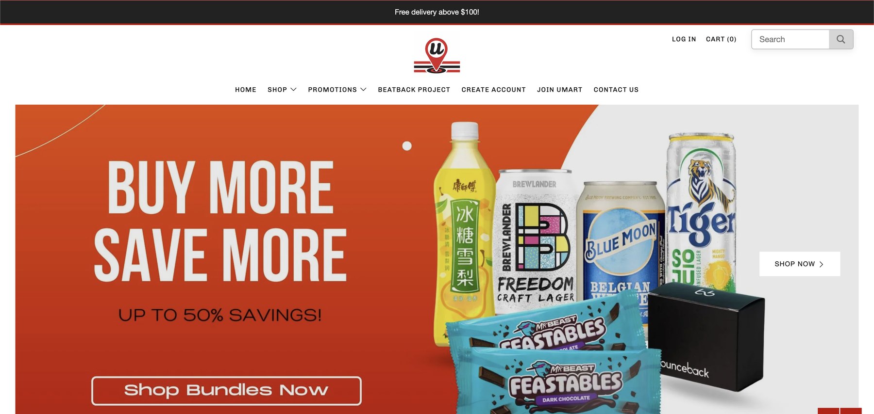

The same homepage, rebuilt — drag the gold divider
Three moves, one goal.
One-glance answers
Delivery terms, the four stores, and late-night hours sit beside the hero — the three questions every visitor brings, answered before a single scroll.
Aisle-first architecture
Seven menu items became four. Shopping is organised the way the shops are — by aisle — with search front and centre for people who know what they want.
A voice worth reading
"Everyday prices. Everyday surprises." A brand voice with supermarket-level prices and neighbourhood charm — written to sound like the stores feel.
Closer to the glass.
 Type — friendly, confident, unmistakably retail
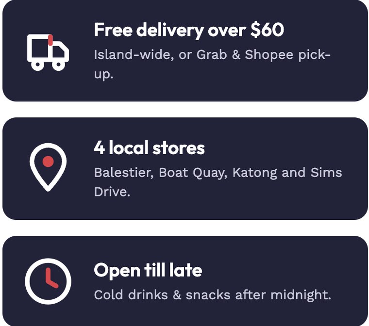 The three answers, promoted to the hero
 Shop by aisle — curated, not cluttered
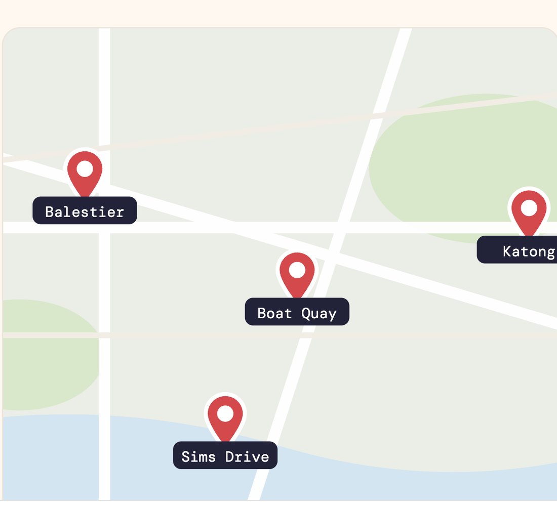
Four stores, one tap.
A convenience chain's website has one job above all others: get someone to the nearest open store. The new outlet finder puts all four on the map with hours and directions — and the enquiry form even lets shoppers pick their preferred store, so feedback lands with the right team.
It's the difference between a website that talks about uMart and one that walks you there.
The website was chapter one.
Behind the new site sits a full rebrand — a new identity, a new voice, and a new way for a 4-outlet chain to show up online. The whole story, from the old logo to the last line of copy, is in the case study.
Got a site that's underselling you?
Tell us what your customers keep asking. We'll build the website that answers before they finish typing.
Work with us →